Learning Objectives – Get a detailed understanding of the different areas of the style menu and how they work.
How to access the Style Menu
The Style Menu can be found in the control panel, as previously mentioned in Module 3. Clicking on the Style option will open the menu in place of your legend on the right side of your screen.

Pin Style
The first style option is based around the default pin. You can change the pin color by clicking on the colored box and choosing a color (1). You can also change your pin icon by clicking the dropdown under the default pin (2). Your own custom logo can also be uploaded to your account to be used as a pin icon on your map. The transparency (3)and size of your pins (4) can also be changed using this menu.
Dynamic Point sizing adjusts how your points appear on the map based on zoom level. This feature is only available on the default circle point styling, and can be turned on using the checkbox (5). Turning on the Show label on Mouse over setting B (6) allows you to see a label when hovering over a data point. Clustering on groups nearby points into clusters. These are displayed as circles with a number indicating the count of features in each cluster. Clustering can be turned on using the checkbox (7).

Labelling
You can also add labels to your map through the style menu. Any column in your data can be used as a label and will be displayed above or below the pins on your map according to your selected position setting. You can choose which dataset you would like to label from the Dataset dropdown. There are several label settings that we will go through in more detail. To turn labels on, click the OFF option beside the Labelling setting in the style menu.

The first of the Labelling options is Label Settings. There are three style options for labels, which can be changed using the Labelling drop down. Optimized Labels will display as many of your labels as possible, without having them overlap with other labels. Optimized labels will also place the label in the best position possible for your map, ensuring that your data and labels are not obscured. If a label is positioned away from your data point, a leader line will be drawn from the label to the corresponding point. You can change the color of this line using the Line Color option at the bottom of the style menu. Checking the Inherit from pin option will set the color to be the same as the color of your pins.

Non – Overlapping Labels will only display labels that don’t overlap. If a label does overlap, only one of the overlapping labels will be displayed.

The All Labels option will display every label on the map regardless of whether they overlap with other labels or not. This is more likely to happen at further zoom scales, or in areas where there are a lot of data points.

You can also add a box to your label by turning the Box option on. -png.png?width=250&height=216&name=Label%20box%20settings%20style%20menu%20(Zoomed)-png.png)
Label Columns
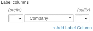
Any column in your dataset can be used as a label. You can choose the column that you want to be displayed by selecting it from the drop-down menu. You can also add a Prefix/Suffix (e.g. £,$,€,% ) to your label by choosing one from the corresponding drop downs or you can type in your own prefix/suffix into the box.
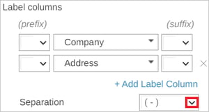
Additional labels can be added by clicking the Add Label Column option. Using this option, you can add up to 2 additional columns or attributes for labelling. You can also choose the way you want your additional labels to be displayed, by choosing an option from the Separation drop-down. You can include 3 separate attributes as part of your label.
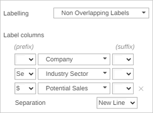
This example creates a complex label using 3 attributes from the dataset, separating each on a new line and adds $ sign as a prefix.

Label Styling
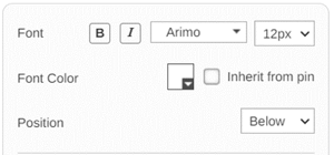
Here you can change the font style of your labels, make them bold or italic, and change the size and color. The color can be set to match the pin color by checking the Inherit from pin option. The position of your labels can be changed to place the labels above, below, or centrally.
You can choose whether your label has a box or if the text is free standing. If the box option is turned on, you will then have the option to change the fill and border colors of the box.

Color by Value
Using the Color by Value option allows for easy visualization of your data using color coding. This can be useful for visualizing different areas, or different classifications within your data. To turn on Color by Value, go to the panel in the style menu and click on the Color by Value off button.
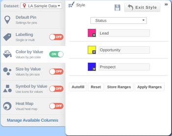
You can use color by value on both text and numeric fields. The above example is a text field and is referencing the status of potential customers. In the dataset these are split into Lead, Opportunity, and Prospect. The Color by Value styling method will assign each type of customer a color. You can select which color to assign to each type by clicking on the colored box beside the type name. You can also set the first and last color ranges and click on the Autofill button to complete the colors for the intermediary ranges. Clicking on the Reset button will reset the ranges and colors back to the default. You can change the column you wish to color by, using the drop down above the colors.
Numeric Fields
Numeric fields work similarly to text fields, but there are more options to customize. Typing a value into the text boxes allows you to set your value ranges.
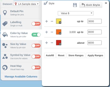
You can also add or remove a range by clicking on the + or - buttons. If you have value ranges that you wish to save or reuse in the future, you can use the Store Ranges option. This will save both your value ranges and your color range choices. You can then apply a stored range by clicking the Apply Ranges option. This will then open the Apply Ranges window, where you can either apply just your saved colors or both your color and value ranges.

Size by Value
The Size by Value option can be used to easily distinguish your pins based on a value range. You can set this range using the Min and Max value text boxes and set the pin size using the Diameter text boxes. An important note is that Size by Value can only be used on a numerical column.
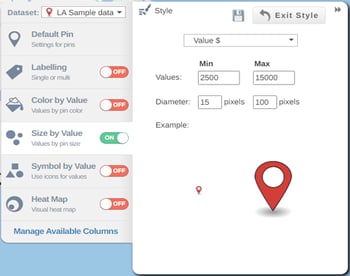
The color of the pin can be changed in the Default Pin section, and color ranges set in color by value will still apply if the setting is turned on. The column being used to style by can also be changed in the legend when the style menu is closed, by clicking on the drop down above the symbol value indicator.

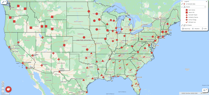
Symbol by Value
Symbol by Value allows you to visualize your data using different symbols. Any column in your data can be used for this styling method and can be chosen from the drop down above the symbols. Each symbol can also be changed using the drop down on the symbols.

Custom symbols can also be added to your eSpatial account. If you click the dropdown beside the Pin Style icon, you will see the Add your own icon prompt. Clicking on this will open an email that will be sent to help@espatial.com. You can attach any images that you want uploaded to your account, as long as they comply with the criteria outlined in the email.

The color of the pin can be changed in the Default Pin section, and like Color by Value, ranges can be set, stored and applied to this styling method.
If using a text column to style by Color, Size, or Symbol by Value, only columns with a maximum of 50 unique values can be used. Using a column with over 50 unique values will result in an error message being shown.
Heat Map
The hotspot heatmap can be used as a visual heatmap based on point density or numeric values that are in your dataset. The Hotpsot heat map defaults to darker colors for low density areas, and brighter colors for high density areas. The default is set to point density but you can also use other numeric values from your dataset. You can choose these from the drop down list at the top of the box. The color pallet of the heatmap can be changed using the Palette dropdown.

The Transparency, Intensity, and Radius can all be set/changed using the corresponding sliders. The type of radius can also be changed to either pixels, miles, or kilometers by clicking the Pixels option.

Average density is the density of the data if it was equally distributed on the map. The average density is calculated for an individual dataset i.e. it is different from dataset to dataset.
The radius option lets you alter the area of influence of a single point i.e. how much area a point represents/impacts.
Practical Exercise 6 – Styling
Overview - This exercise allows you to test adding styling options to your data.
- Change the pin icon, size and clustering of your data.
- Apply a color by value setting on a numerical column
- Apply a symbol by value setting on a text type column
- Apply the heatmap to identify high density areas in your dataset.