Learning Objectives – After completing this class you will know how to create a Regional Heatmap, and have a strong understanding of the benefits, use cases, and best practices associated with this map type.
What is a Regional Heat Map ?
A regional heat map is a color-coded geographical representation of your data, highlighting the data's density.
A regional heat map, commonly known as a choropleth map, uses color-coding to indicate differences in one particular variable. For example, you would use a color scale to indicate ranges related to each state or territory's aggregate sales value or volume. Each color shade would indicate a different value range.
Use Cases
Heat maps are perfect for data analysts and marketing, sales, service, and operations teams. You can analyze data fast and gain hidden insights that lead to better decisions. It is a great way of aggregating data, and is similar to how a Pivot Table in Excel works.
Spot customer trends or areas for further investigation
Regional Heatmaps can be used to identify high- and low-performing sales or service areas. An example of this would be to use a heatmap to map a customer satisfaction rating scale. Using a column in your data, you can highlight which territories have the most dissatisfied clients, even on a nationwide basis, so management can immediately start making necessary changes to improve the situation and avoid any severe loss of business.
Uncover sales patterns
Regional Heatmaps can help to uncover sales trends in particular locations, such as higher product or service sales among a specific customer demographic or sudden habit changes (e.g., once-reliable clients cutting back on usual orders with little or no warning).
Identify the best places to start campaigns
Using a Regional Heatmap to map demographics such as existing customer location, or the location of a target audience, can help to determine where to run effective marketing campaigns. For example, once a marketing team identifies the ZIP codes containing most of their target audience, they can use their budget and resources effectively by planning and executing their campaigns in the high-value areas they found on the map.
Benefits
Regional Heatmaps can be used to help you get a big-picture overview of your customer data, and help you track metrics like customer satisfaction and market performance. Below are some common benefits of using regional heatmaps.
View customer densities Geographically
One of the biggest advantages of using eSpatial to create a Regional Heatmap, is it allows you to pinpoint density variances in an actual geographical context. This can then help you conduct a more thorough analysis.
Best practices
- Choose an appropriate color scheme to highlight categories of importance.
- Choose an appropriate color scheme or style to highlight outliers.
- Choose the right attribute in your data to summarize in the heatmap. Examples of this include the count of pins in each region, the total revenue generated, or the average income.
- Ensure the value ranges of each of the categories is meaningful and adjust as needed.
Steps to create
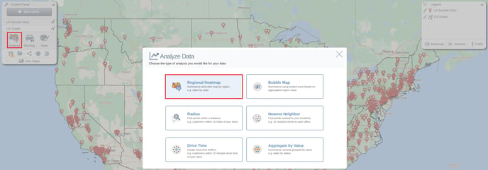
Like all eSpatial Maps, the first step in creating your map is adding your data. Module 1 Class 2 will give you all the information about how to do this. The next step is to click the Analyze option from the Control Panel and choose Regional Heatmap from the menu.
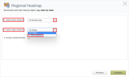
From here you will be prompted to choose both a point and region dataset. If you only have one point dataset on your map it will be selected by default, but if you have more than one, you can choose which dataset you want your heatmap to be based on using the dropdown menu. A region dataset must also be chosen. If you have a region dataset on your map, this will be suggested by default, however, you can use the Add Dataset option to pick a different regional dataset for your heatmap to be built on. As well as the eSpatial boundary datasets, you can also use your territory alignments or custom areas.
Once you have chosen your datasets, click Complete to create your heatmap, which should look something like the map below.
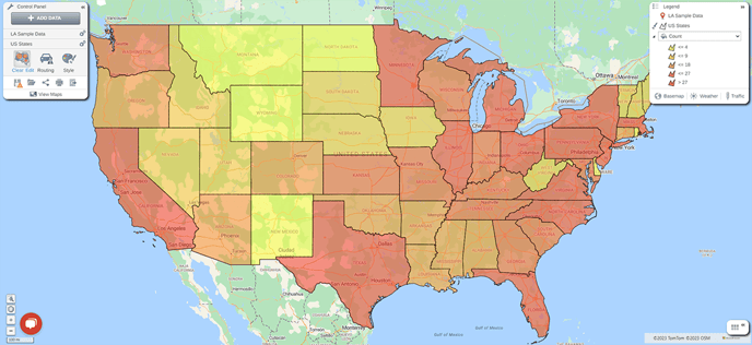
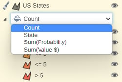
The heatmap setting defaults to count, as can be seen in the legend. You can change this to any numerical column from your dataset using the dropdown menu. You can change the colors of the heatmap using the color by value option in the Style menu.
Understanding your Regional Heatmap data
Region Dataset
When you expand the table you will see your values aggregated by your region.
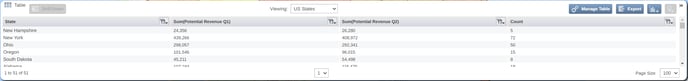
If you chose to include outside results from the Regional Heatmap settings, you will also see a category called Outside that sums all the pin values that fall outside your regional dataset. You can include additional numerical columns to this table by selecting Manage Table in the top right of your table. To see a more detailed view of the pins that fall within a region click on the region in the table and select the drill down option.
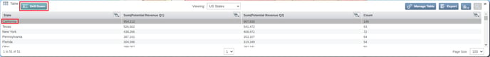
This will navigate to the pin dataset in your table filtered to your selected region. It will also filter to that area on the map.
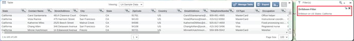
Pin Dataset
Alternatively, you can also see all your pin data on your table by using the navigation bar. This data will display with an additional column stating which region the pin sits in. If you have included outside results the area name will display as OUTSIDE for pins not located within your region dataset.