Learning Objectives – To understand what the Legend, table, Control Panel, and the Top Toolbar are, and how each work.
The Legend
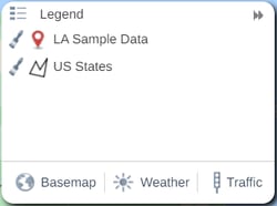
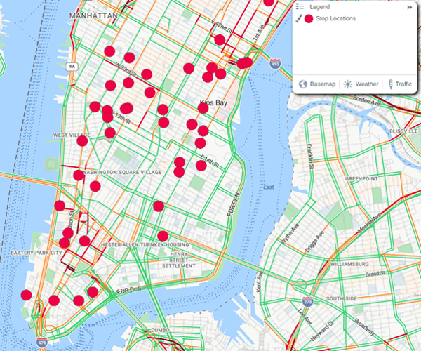
The legend is where you can see what data is on your map. It is located to the top right of your screen and can be expanded and collapsed using the Double Arrows icon. In the below screenshot, the Learning Academy Sample Data dataset and the US States dataset have both been added to the map, so they are listed in the legend. The Pin Icon beside the sample dataset indicates that this dataset is a point/pin dataset, whereas the outline/boundary icon beside the US states dataset indicates that this is a boundary dataset.
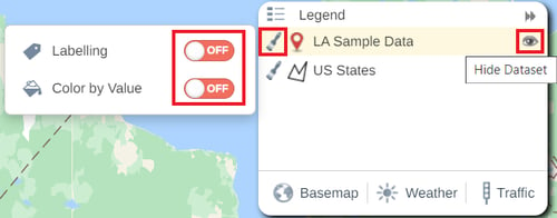
You can hide datasets from the map by clicking the Eye Icon in the legend, and toggle Color by value and Labelling by clicking on the Paintbrush icon. If you have turned on any other styling options, such as Size by Value or Heatmap, these will also appear when you click the Paintbrush.
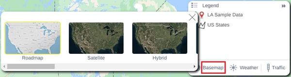
The basemap can be changed by clicking on the Basemap option and selecting a new basemap by clicking on one of the thumbnails. There are 12 options to choose from including the default ‘Roadmap’ option. These 12 options cover a range of styles, including a plain basemap available if you do not want a background.
You can also add either a satellite or radar weather overlay using the Weather option. The Satellite overlay adds a colored scale of cloud cover that can be viewed in the legend, while the Radar overlay gives Rain, Snow, Ice, and Mixed weather scales. Below is an example of the Satellite Weather overlay on a Hybrid basemap.

While the basemap can be changed and a weather overlay can be added within eSpatial, please note that when exporting your map or downloading your map for printing, the map will be set back to the original basemap, and the weather filter will be removed.
Live Traffic information can also be overlayed. This is available at the bottom of the legend by clicking on the Traffic button.
The Table
The table is where you can see the data you have added to your map and the results data from any analysis you have applied. The table is located along the bottom of your screen and can be expanded or by clicking the Double Arrows in the top right of the table.

There are also several functions that you can perform in the table. The Manage table button allows you to edit the columns visible in your table. When the Manage Table button at the top of the table is clicked, the Manage Table window opens. Here, you can add columns to your table, re-order the columns already in your table, and remove columns from the table.
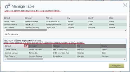
Clicking on a column name in the top table will add it to the columns used in the Map Table. Columns that you can add to your table will appear white, while columns that have already been added will be highlighted in green. You can click on a column name in the bottom table to drag and re-order the columns. The X beside a column name in the preview table means that it can be removed. Clicking on the X will remove the column.
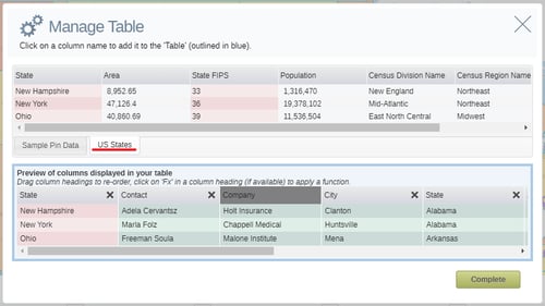
You can also Manage your Table when there is an analysis present on the map. When this is the case, the data table for the pin dataset will automatically be updated to include the region area information. You can also add columns from your regional dataset to your pin dataset from within the Manage Table option. Ensure you have selected the regional dataset (US States in the below example) and click on any column that is not highlighted in red to add it to your pin dataset.
Adding a Point to your table
You can use the Pin icon in the top right corner of the table to add a new record to your dataset from the table. The newly created record will be reflected in all maps using this dataset.

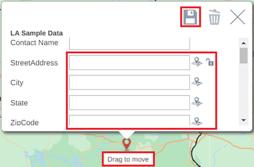
Once you click on Add Record, a point will be added to the middle of the map with a blank info box. From here you can enter address or Lat/Long info, ensuring it’s in the same format as the original location settings in the uploaded dataset. Once the address or co-ordinates are entered the point will relocate to the correct location on the map. If the point does not move to the correct location, you can move the point on the map by clicking the Edit button, hover over the pin until Drag to move appears and then click and drag the point. Once the point is in the right place, click the Save icon in the pop-up window to add it to your dataset.
Filtering Data in your table
Another function of the table is the ability to filter your data. This can help you narrow down areas and further analyze your data. There are three types of filters you can use – Numerical, Text, and Date. All three types require you to first click the Filter button in the table, and then choose the Filter Results option.

To Filter Numerically, you can use a range of values, or You can filter by a Range of values or Equals and Not Equals options. Once happy with your filter, click the Lock Icon to lock it in place. To remove the filter, click on the X icon.


If a Text field and has less than 50 distinct values, then the filter window will appear as in the first screenshot below. This will allow you to use the check boxes to choose one or more values to add to/remove from your filter. If a Text field has more than 50 distinct values then the filter window will appear as in the second screenshot. In this case, you can click on the drop down to select the criteria you want to type into the text box. If you have slightly more than 50 distinct values and would like to use the tick box filters, contact us through in-app chap and we may be able to increase your account.


You can also filter a Date field by clicking on the filter icon at the top right of the date column. You can then use the ‘From’ and ‘To’ date to specify the start and end date of the data you want to view. It is important to note that a date filter can only be applied to data that has been imported as a date. This can be checked at the add data stage pre upload.

Exporting Data from your table
You can export data from your map using the table. To do this, click the export button in the table and a CSV file will be downloaded.

If you have a filter in place when you go to export your data, only your filtered data will be in the export.
The Control Panel
Your control panel is located to the top left of your screen and has several functions. It too can be expanded or collapsed using the Double Arrows in the top right of the panel.

The Add Data button can be found here, along with the datasets that are currently added to your map. The datasets can be rearranged by dragging them into different orders. The order dictates what order the datasets are rendered on the map. Clicking the cog icon beside a dataset will open a pop up with several settings relevant to each dataset.
The Analyze and Style menu are also present in your control panel. The Analyze option allows you to perform several types of spatial analyses on your data, while the style menu allows you to customize your boundaries and pins with colors, icons, labels and more. Both the Analyze and Style menu will be looked at in greater detail later in the course.
The five icons underneath the Analyze and Style options are all based around saving, sharing, and exporting your maps. These will be explained in more detail in the red info box below. The View Maps option allows you to view and enter all maps that are currently saved in your workspace.
There are 4 icons in the control panel based around saving, managing, sharing, and exporting your map. Each one will be briefly explained below.
![]()
![]() - The save icon allows you to save your maps, save a copy of your maps, create a new map, open a previously created map from within the workspace, move your map to another workspace, and discard any changes you have made since your last save. The Orange Warning Icon will appear when there are unsaved changed to your map. Each function of the Save button will be broken down in more detail in Module 6.
- The save icon allows you to save your maps, save a copy of your maps, create a new map, open a previously created map from within the workspace, move your map to another workspace, and discard any changes you have made since your last save. The Orange Warning Icon will appear when there are unsaved changed to your map. Each function of the Save button will be broken down in more detail in Module 6.
![]() - Clicking on the open icon allows you to open any map that has been created in the current workspace.
- Clicking on the open icon allows you to open any map that has been created in the current workspace.
![]() - The share icon allows you to share your maps either publicly or within your team. More info on how to share your maps will be available in Module 6.
- The share icon allows you to share your maps either publicly or within your team. More info on how to share your maps will be available in Module 6.
![]() - The Export button gives you the option to export your map as a PDF, PowerPoint MapBook, or a PNG Image. More info on how to export maps will be available in Module 6.
- The Export button gives you the option to export your map as a PDF, PowerPoint MapBook, or a PNG Image. More info on how to export maps will be available in Module 6.
Top Tool Bar
The top tool bar is located at the top of your screen. You can use the toolbar to add address points, search for addresses, draw custom areas, and add annotations.
Adding an Address Point

The address point icon is the first icon in the top tool bar and it allows you to drop a pin on the map. When clicked, a point will be attached to your cursor. You can then click on the map to place the point, and the information window showing the address of where the point was plotted will open.
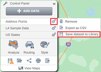
Any address points plotted on the map will be added to a Dataset called Address Points, which will be viewable in your Control Panel. This dataset can be styled as normal, however it will not appear in your library and will only be available on the map which the address points are created. To add this dataset to your library, click the cog icon next to it in the control panel, and select Save dataset to Library.
Adding a Map Annotation

Map Annotations can be added to your map by choosing the Text Box icon. Annotations can be useful to highlight info about your map that contains too much text for a label. Another use for them would be to give extra context to areas/regions of your map. It can also be used to embed a corporate logo on your map or other useful images or videos. After clicking the annotation icon, click on the part of the map you wish to add it to, and the annotations panel will open. The current name of the map will be added as text.
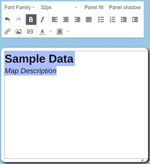
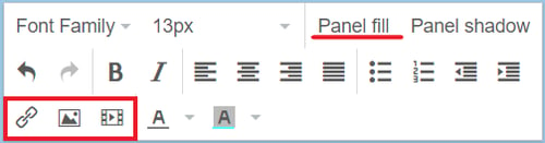
The Settings panel will open above the text panel. Here you can change the text, font, add bullet points, and more. Click anywhere in the panel to add your own text, or you can also copy and paste text from other sources. Images, videos, and links can be added to the annotation by clicking on any of the ‘Add’ buttons highlighted below, and the color of the panel can be changed by choosing the Panel fill option.
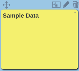
Hovering over an annotation will bring up the editing icons. The Crosshair icon allows you to move the panel around the map, and you can edit anything in your panel by using the Pencil icon. To delete your annotation, click the Trash can icon. You can also set the Annotation to be fixed to a location, which means it will move while you pan the map.
Performing an Address Search

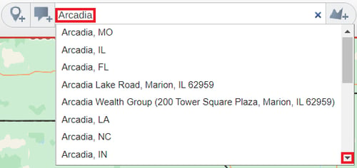
The address search can be used to search for business/home addresses or wider geographies such a zip codes, states, or even countries. Once you start typing the address, any matching addresses will appear in the drop-down list. Clicking on one of these will add it to your map as an address point. If you click the enter key on your keyboard all 20 address suggestions will be added to your map.
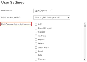
You can limit the country/countries that your address search applies to. This can be useful if you are looking up the name of a business that has locations worldwide, or a common street name. To do this, go to your User Settings by clicking on the option in the drop – down menu at the top right of your screen.

Once in here, check the boxes beside the countries that you want your address search to include.
Drawing a Polygon
The Draw Polygon option allows you to create a Custom Area on your map. This can be useful if you are looking to group data points or get additional information about an area that isn’t available in a boundary dataset. Hold down the left button on your mouse and draw the shape of the area that that you require. If you prefer, you can also left click on the map to create waypoints in the polygon until you have drawn the area and shape you require. Double clicking on the start point of the shape, or clicking the check icon in the Top Tool Bar will complete your custom area.

Once complete, the area will be outlined by a solid red line, the color and thickness of which you can change in the Style menu. Clicking on the Edit icon allows you to adjust the polygon, which you can do by dragging the circles to different locations. The Save icon lets you save your edits, and the Trash Can will delete the Custom Area. Clicking on the X will close the info window.
You can also use a custom area to filter data. Once your custom area has been drawn, click anywhere inside it to bring up the info pop up. From here, click the Filter option and select the dataset that you want to filter by. This will remove all other data points from the map and add the filtered points to your data table. The filter can then be removed by closing it in the table.
Practical Exercise 4 – Experimenting with your map Interface
Overview – This exercise allows you to experiment with the different map interface components.
- Practice changing the basemap or adding a weather overlay.
- Create a map annotation and customize it.
- Create a custom area and use the filter option to view just the accounts that fall inside it.