Learning Objectives – After completing this class you will have a strong understanding of the benefits, use cases, and best practices of a pin map.
What is a Pin Map?
A pin map is the simplest way to show your data on a map in eSpatial. A pin represents a geographic location.
Use Cases
The simple pin map can have many use cases. Being able to visualize your locations as pins on a map transforms how you understand your critical sales, marketing, revenue, and operations data. The use cases of a pin map can even involve several teams/departments within the same business. Some common use cases are:
Analyze competitor locations
Sales teams can view and analyze customer locations to try and identify new opportunities. Seeing the location of potential customers laid out on a map, and analyzing customer densities, can help to identify which areas to target. Styling options such as color by value can make targeting new customers even easier by allowing you to color code the status of potential customers, making it easier to prioritize by sales potential or sales probability.
Location based planning
Visualizing your data as pins on your map can also lead to much easier location based planning. Marketing teams can plan new campaigns or locations for events, while Operations teams can map potential depot locations and analyze customer densities.
Benefits
Display vast amounts of data
Using pin maps allows you to plot large amounts of spreadsheet data on a map. This then allows you to quickly summarize and group pins by geographic regions. A pin map allows you to plot vast amounts of data on a single map. For example, you have 10 locations in one Zip code. Your pin map will summarize that (using clustering) as a symbol with the number 10. Clicking the symbol enables you to drill down and reveal the individual points, which is useful if you are mapping large datasets in a region.
Compare and contrast layers of data
A pin map allows you to create complex visualizations that reveal the different levels of data that impact your business. The ability to add multiple datasets to your map (for example separate customer, sales rep, and warehouse datasets) and to style them by color or size of symbol makes it easy to differentiate, compare and contrast data layers.
Analyze both large and small areas in detail
Although pin maps in eSpatial will be useful in their default states, sometimes it can be useful to examine a smaller amount of data. This can be done using filters, which give you the option to view only a particular group of pins. Your filter could be based on an area, such as a particular state or zip code, or a piece of data such as all of the customers your team has visited in the past year. You choose the detail, and the filtered pin map will make it a visual reality.
Best practices
Use color and symbols to differentiate your datasets and categories. For example, use Color by value, to separate different status or metrics, and Size by value to highlight different value ranges, such as revenue amounts or employee numbers. Use labels to add useful information to your pins when the data is not too densely located.
Steps to create
The steps to create a pin map have been mentioned previously in Module 1 class 2, but we will go through them briefly again here. The first step to creating a map is to click the Red Create maps tab and then select Create Map. This will open the Add Data window, where you can click the Upload new data option and select the file you want to visualize. From here, the Upload Data window will open, and once your location columns are correct, click complete to add your data to the map.
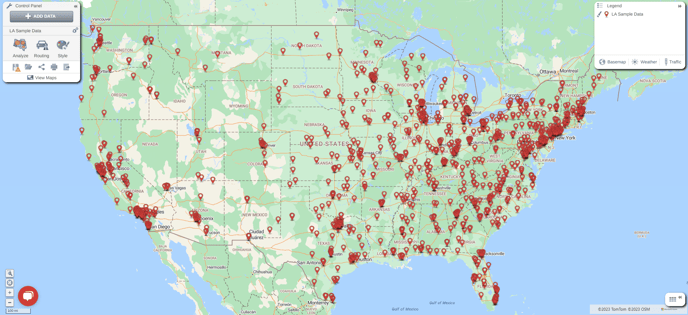
Once your data has been uploaded, it will look something like the map above. From here you can use the style menu to customize your pins by changing the icon or color, add labels, or use the color, size, or symbol by value styling options. These styling methods are explained in detail in Module 4.
Once you have created your pin map, other data can be added to the map in the form of more pins from another dataset, or a boundary dataset from your library or the eSpatial datastore. Details of how to add these to your map can be found in Module 1, Class 2.
Practical Exercise 7 - Pin Maps
- Upload multiple layers of information.
- Turn the layers on/off from the legend to see the differences
- Use different styles for each layer so you can clearly differentiate between the datasets
- Use transparency on a dataset so you can see multiple datasets at once
- Experiment with the different clustering options if presenting prospects in a presentation it might be better to have clustering on to save you having to count each individual pin.